
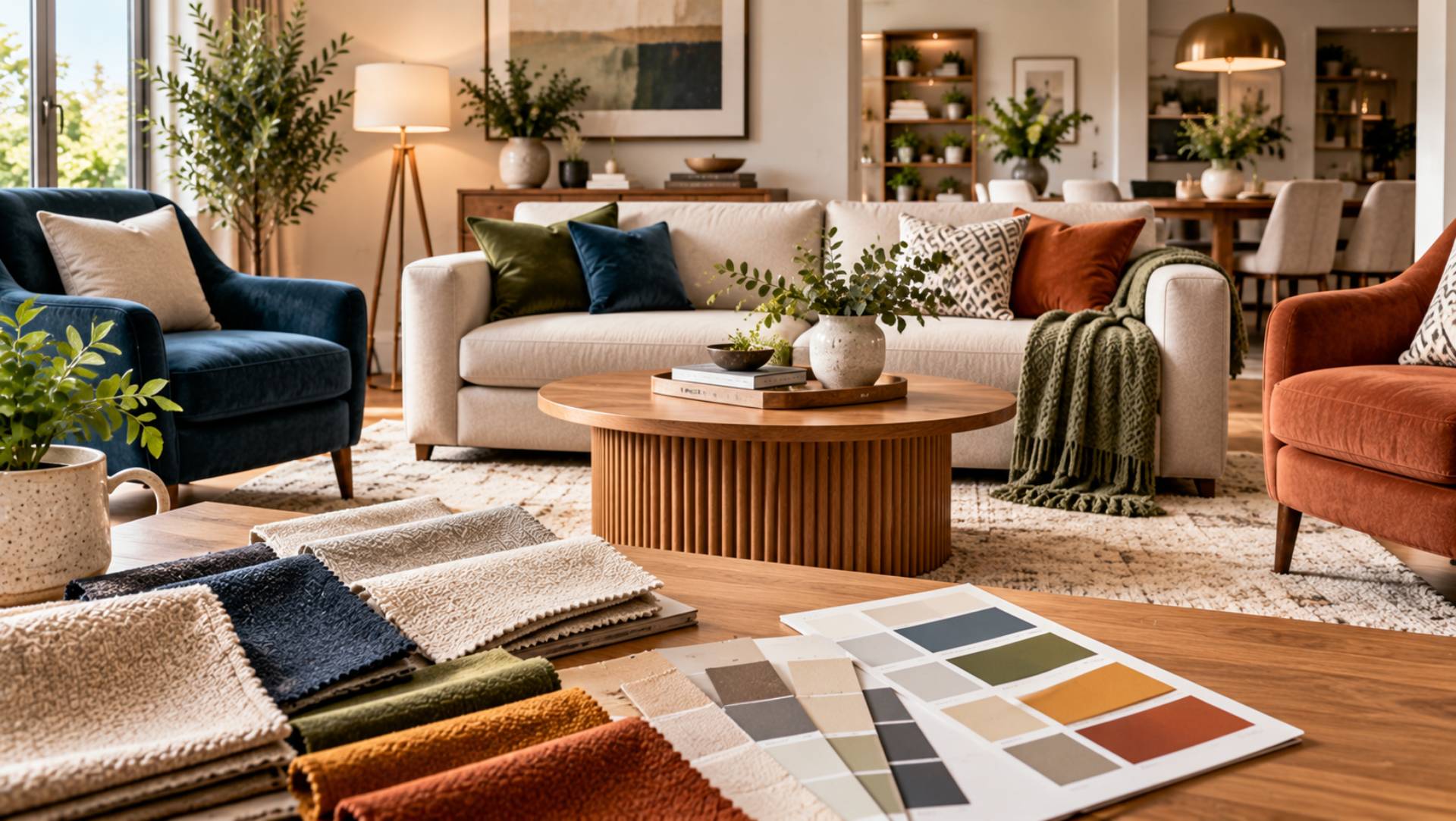
How to Select Furniture Colours That Match Your Home
Choosing furniture colours can completely change how a room feels. The right sofa, dining chairs, bed, or cabinet can bring a space together, while the wrong shade can make otherwise attractive furniture look disconnected from the rest of the interior.
The good news is that furniture does not need to match every wall, floor, or accessory exactly. In fact, rooms often look more natural when colours complement one another rather than repeat perfectly. The aim is to create balance between your furniture, existing finishes, natural light, and personal style.
A little planning before you buy can also prevent expensive mistakes. Large furniture tends to stay in a home for years, so choosing colours that work with your surroundings gives you more freedom to refresh the room later.
Start With the Colours Already in Your Home
Before looking at new furniture, study what is already fixed in the room.
Walls can be repainted fairly easily, but flooring, kitchen units, fireplaces, built-in storage, tiles, and large architectural features are usually more difficult or expensive to change. These permanent elements should influence your furniture choices.
Look at the undertones as well as the obvious colour. A wooden floor may appear brown but have warm red, yellow, or grey undertones. White walls may lean towards cream, blue, or grey.
Choosing furniture that relates to these undertones often produces a more natural result than simply matching the main colour.
Build a Simple Colour Palette
Creating a basic colour palette before shopping can make furniture decisions much easier.
Start with three broad groups: a main colour, a supporting colour, and one or two accent shades. Your main colour may already come from the walls or flooring. Furniture can then introduce the supporting shades, while cushions, artwork, lamps, and accessories provide smaller accents.
You do not need to follow a strict formula. The purpose of the palette is simply to give you a reference point so every purchase does not become a separate colour decision.
Keep samples or photographs of important finishes on your phone when shopping. This makes comparing fabrics, woods, and painted furniture considerably easier.
Decide Whether You Want Harmony or Contrast
Furniture can either blend gently with its surroundings or deliberately stand apart.
A beige sofa against warm neutral walls creates a quiet, coordinated look. A deep green sofa in the same room creates more contrast and becomes a stronger focal point.
Neither approach is automatically better.
For calm bedrooms and relaxed living areas, closely related tones can work particularly well. Dining rooms, entrance halls, and larger living rooms may be able to handle stronger contrast.
Think about the atmosphere you want before choosing the furniture colour rather than selecting a shade simply because it looks attractive in a showroom.
Understand Warm and Cool Undertones
Undertones are one of the main reasons two colours that appear suitable separately may feel wrong together.
Warm shades often contain hints of yellow, orange, red, or brown. Cool colours tend to lean towards blue, grey, green, or violet.
For example, a cool grey sofa can sometimes feel uncomfortable beside very warm cream walls. A warmer greige or taupe may create a smoother transition.
You do not always need to keep everything entirely warm or entirely cool. Mixing temperatures can add interest. However, there should usually be enough repetition elsewhere in the room to make the combination feel intentional.
Use Neutral Furniture for Greater Flexibility
Neutral furniture remains popular because it is easy to update around.
Cream, beige, taupe, grey, brown, charcoal, and muted natural shades can work with many decorating styles. If you like changing cushions, curtains, rugs, and artwork regularly, neutral larger pieces give you more flexibility.
This approach can be particularly practical for expensive items such as:
- Sofas
- Beds
- Dining tables
- Large cabinets
- Sectional seating
- Wardrobes
Neutral does not have to mean plain. Texture can create interest through boucle, linen, velvet, leather, woven fabrics, or visible wood grain.
Introduce Strong Colours Carefully
Colourful furniture can give a room personality and create an immediate focal point.
Deep blue, forest green, rust, burgundy, mustard, and other saturated colours can work beautifully on armchairs, sofas, dining chairs, or occasional pieces.
The key is deciding whether you are comfortable living with the shade for several years.
Large upholstered furniture can be expensive to replace or recover. If you enjoy bold trends but often change your decorating style, consider using stronger colours on smaller furniture rather than your main sofa.
A coloured armchair, side table, bench, or dining chair can introduce personality without determining the entire room.
Consider Existing Décor Before Buying
Furniture rarely sits in isolation. Rugs, curtains, artwork, cushions, lighting, flooring, and decorative objects all influence how a colour appears.
Reviewing your existing colour schemes can help you identify shades that already repeat naturally throughout the room.
You may discover that a small colour in a rug or artwork would make an excellent furniture shade. Repeating that colour elsewhere can create a subtle connection without making the room appear overly coordinated.
This is often more effective than choosing a completely new shade with no relationship to anything already present.
Check Furniture Colours in Different Light
Lighting can dramatically alter colour.
A fabric that looks beige in bright daylight may appear much warmer under evening lamps. Grey upholstery can look blue in one room and almost brown in another.
Natural light also changes throughout the day. North-facing rooms may feel cooler, while strong afternoon sunlight can make warm colours appear more intense.
Your interior lighting also affects how furniture finishes and fabrics appear after sunset.
Whenever possible, take fabric or finish samples home before ordering large furniture. Check them in morning light, afternoon light, and artificial lighting. This simple step gives you a much more reliable impression than viewing a small sample under showroom lights.
Match Furniture With Flooring
Flooring creates one of the largest colour surfaces in a room, so it deserves careful consideration.
With wooden floors, avoid assuming that all timber furniture must match exactly. In many cases, slightly different wood tones create more character.
The important point is to make the combination look deliberate.
A light oak floor can work with darker walnut furniture when the contrast is clear. Problems often occur when two timber colours are almost identical but noticeably different.
With carpets, consider both the main colour and any pattern. Large furniture should usually work with the carpet rather than compete heavily with it.
Stone and tiled floors can often support furniture with warmer fabrics or natural textures that soften the overall room.
Think About the Size of the Room
Colour can influence how visually heavy furniture feels.
Dark furniture tends to have greater visual presence. In a spacious room, that weight can help anchor the design. In a compact room, several large dark pieces may make the space feel crowded.
Lighter furniture can create a softer impression, particularly when it relates closely to the wall colour.
This does not mean small rooms cannot contain dark furniture. One dark sofa or cabinet can create attractive contrast when the rest of the layout remains balanced and uncluttered.
Coordinate Rather Than Match
A home can start to feel flat when every item is the same colour.
Instead of buying a complete furniture set in one finish, look for pieces that share something in common without being identical.
For example, a living room might combine a cream sofa, olive chairs, a dark timber coffee table, and black metal details. The colours differ, but they can still belong within the same overall scheme.
Repeating each important colour at least once elsewhere in the room can help create visual continuity.
A green chair might connect with artwork or cushions. Dark table legs could relate to black lamps or picture frames.
These small repetitions help varied furniture feel considered.
Use Wood Tones as Part of the Colour Scheme
Wood is a colour as much as it is a material.
Oak, walnut, mahogany, ash, pine, and painted timber all influence the room’s overall palette.
Mixing wood tones can work well when there is some connection between them. Similar undertones, repeated finishes, or a clear light-to-dark contrast can help.
If you already have several timber pieces, avoid introducing another finish without considering how it relates to the existing furniture.
You do not need every wooden item to match. A room containing only one wood tone can sometimes feel more like a furniture showroom than a lived-in home.
Think Long Term With Expensive Furniture
Before buying a large piece in a fashionable colour, consider whether you would still enjoy it after decorating trends change.
This matters particularly for sofas, beds, wardrobes, and dining furniture.
If you strongly love a particular colour, there is no reason to avoid it simply because it is bold. Personal preference matters more than trying to create a completely trend-proof home.
The difference is choosing a colour intentionally rather than buying it because it appears frequently in current interiors.
For items you expect to own for many years, colours that work with several possible decorating schemes generally offer more flexibility.
Test Before Making the Final Decision
Samples are extremely useful when choosing furniture colours.
For upholstery, request the largest fabric sample available. Place it next to the wall, flooring, curtains, and nearby furniture.
For timber, lacquer, or painted finishes, compare samples in the actual room rather than relying only on online images.
Digital screens can display colours differently, while professional product photographs may have been taken under carefully controlled lighting.
Testing at home reduces uncertainty and helps you judge how the material really behaves in your space.
Frequently Asked Questions
What furniture colours are easiest to decorate around?
Neutral shades such as beige, cream, taupe, grey, brown, charcoal, and many natural wood tones generally offer good flexibility.
Can I mix different furniture colours in one room?
Yes. Furniture does not need to match exactly. Using a limited palette and repeating important colours elsewhere can help different pieces feel connected.
Should wooden furniture match the floor?
Not necessarily. Different wood tones can work well together. Aim for either compatible undertones or enough contrast for the difference to look deliberate.
How many furniture colours should I use?
There is no fixed number, but limiting the main palette usually produces a more cohesive room. Additional colours can be introduced in smaller accents.
What is the safest colour for an expensive sofa?
Neutral colours offer the greatest decorating flexibility, but the safest option is ultimately a shade you genuinely enjoy and can imagine living with for several years.
Conclusion
Selecting furniture colours becomes much easier when you start with the home you already have. Look at your flooring, walls, permanent finishes, natural light, and existing décor before deciding what to buy.
Build a simple palette, understand whether your room leans warm or cool, and decide where you want harmony and where you want contrast. Neutral furniture can offer flexibility, while carefully chosen stronger shades can bring character and individuality.
Most importantly, test colours in the actual room whenever possible. Furniture is a long-term part of your home, and a little preparation can help you choose colours that continue to look balanced, comfortable, and personal for years.